October 30, 2010

Organize This: Curio Cabinet

One of my favorite parts about moving into a new space is the ability to organize my stuff exactly the way I want it - in a way that makes sense functionally and looks good aesthetically. So, I am beginning what will probably be a series of posts titled "Organize This" which features some of my most recent put-stuff-where-I-want-it projects. Most of it will take place in the kitchen - where I have a bounty of new cabinets. But I'm going to start in the Dining Room - where I just finished organizing my corner curio cabinet.

If you remember this post last week, we just finished painting the trim and walls of our dining room and had a blank slate of a built-in curio cabinet in the corner of the room.

So, I decided it was finally time to bust out all my china - which has been packaged away for quite a few months now - and set it up in the cabinet. I went back and forth in my mind on whether or not I wanted to use the cabinet mostly as storage for everything I had or if I really wanted to display a few pretty items.

I was thinking that since the cabinet only has glass doors on top and has paneled doors on bottom I would have the ability to create a display section on the top shelves and a storage section on the bottom shelves.

The problem I ran into is that I have 3 sets of china (that's right - 3!), and that's way too much china to store in mostly the bottom section. And in addition to the china, I wanted to store some glasses too - like stemware and goblets. So, I decided I needed to combine display (form) and storage (function) to make the most use of the space.

I started with the upper section of the cabinet - the part where you would kind of see what's inside (through the glass doors that is) - and determined that I wanted items in here that were mostly color neutral and wouldn't clash with the upcoming Thanksgiving and Christmas decor. I started with the bottom shelf and worked my way up the cabinet.

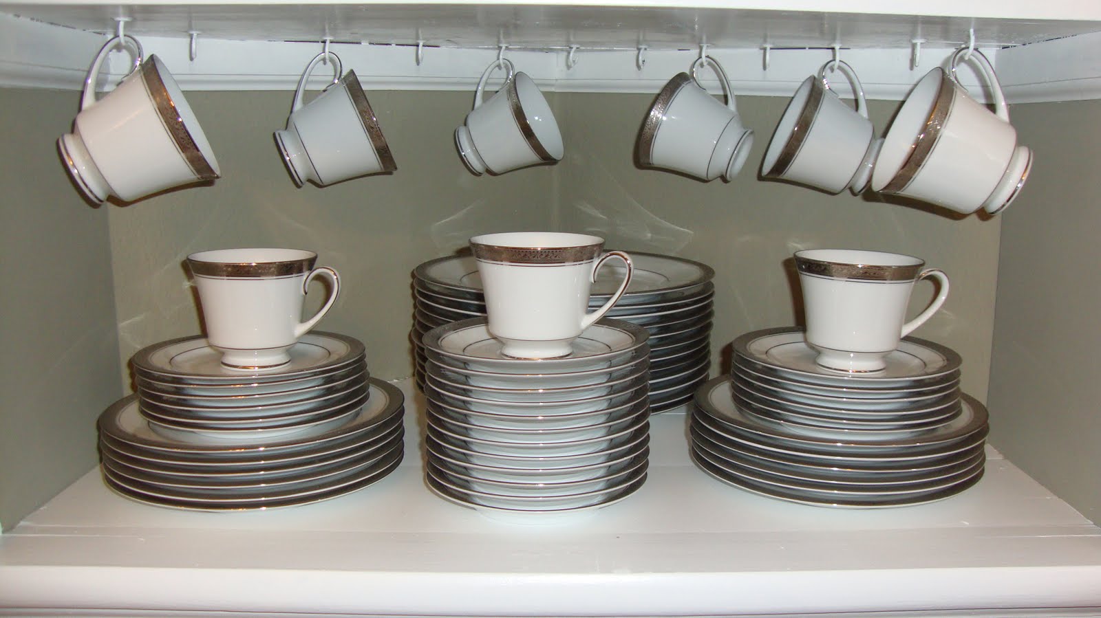
The first shelf already had hooks installed to hang teacups. So, I decided I would use this shelf to store my 12 (yes - 12!) place settings of white and silver china (Noritake's Crestwood Platinum). While there were about 9 hooks available, I chose to hang only 6 cups so that it didn't look too crowded. I then stacked the plates evenly and set 3 more cups on the front 3 stacks. The white china looks really nice against the painted walls. (There were 3 cups left over that I'm just gonna store in the lower section of the cabinet.)

I decided to use the 2nd shelf to store some glassware, which includes 10 water goblets, 5 fruit/sorbet goblets, and 4 glass pineapple taper holders. This is the glassware that I'm most likely to use on a regular basis. I put the 5 fruit glasses in front of the water goblets because they're more interesting looking - with a fruit design on them - and they're shorter than the goblets (so you wouldn't see them in the back anyway). Again, I like that you can see the painted wall color through the glass. It helps make the glasses stand out and still make the whole cabinet feel cohesive.

Third shelf up is where I put my blue and white china. Blue is going to be the most frequent accent color in the room (hence, my blue ceiling and coordinating blue kitchen) and I decorate the dining room with a blue and white "winter" theme from December - January. So, this antique transferware (Wedgwood's Countryside) that I've been collecting since childhood will coordinate well with these colors. I put the different size plates in 3 stacks (which look mostly white from the front) and then set the teacups on top and in front for the pop of blue color.

The top shelf of the cabinet is the least visible of all the shelves. And considering how "full" the first set of shelves were, I wanted to keep this shelf streamlined and simple. So, I just put my white soup tureen and salt and pepper shakers (Pfaltzgraff's Heritage) up there.

As a whole, here is what the top section of the cabinet looks like with the doors open. There is a good combination of white/blue/silver/glass items which gives it variation, but doesn't look too busy since most are very neutral colors.

And with the doors closed, you can still see most of the items through the glass.

Moving on to the lower section of the cabinet, which has 2 shelves to store the remaining items I couldn't fit above. Even though the items are hidden behind painted wood doors, I still felt the need to keep things (mostly) organized (it's the OCD coming out in me).

I divided the remaining items into 2 sections - the top shelf contained the rest of the glassware, including my wine glasses (that I don't use that often) lining the sides and a pretty cake stand (that I also don't use that often) in the middle.

You can see that we chose not to paint the inside of this lower cabinet given that you can't see it behind closed doors and as a reminder of what the "original" cabinet looked like before we took over.

The bottom shelf now contains my 3rd (but only partially purchased) set of china (Lenox's British Colonial) of which I have 12 beautiful glasses, but only a few dinner/salad plates and 1 bowl. This china will be swapped out with the blue transferware above in the spring/summer.

So, there you have it. One whole cabinet combined from a lot of different parts. Very functional, but beautiful when you look at it as a whole. And now that I have easy access to this china (some of which has been packed away for most of our marriage due to space constraints), I hope to use it more often. But in the meantime, at least I can stare at it!

So what do you think? Did I make good choices for the layout of all this stuff? Is there anything you would have arranged differently?

And what have you been organizing recently? Please share! Pin It

October 27, 2010

Take a Guess

Our kitchen is about to have something in common with the following 3 kitchens...

KITCHEN #1

KITCHEN #2

KITCHEN #3

What do they have in common?

Take a guess!

You'll soon find out... Pin It

October 25, 2010

It's All In the Details

Our newly-remodeled kitchen continues to come together bit by bit. We're now working on some of the finishing touches to make it look complete.

Two of the quick kitchen projects Joey worked on this weekend included putting up the crown molding around the top of the cabinets and adding cabinet hardware to the doors and drawers. These may seem like minor details, but they give the kitchen a completely different look.

Here is a picture of the cabinets with no crown molding (you can see the gap between the top of the cabinets and the ceiling) and no cabinet hardware. Still nice looking, but kind of bare.

Now, here is a picture of the lower cabinets with the cabinet hardware. Hardware is like the jewelry of the cabinets - it just adds that bit of bling needed to dress it up.

We used bin pulls for the drawers and knobs for the doors.

The drawer pulls have kind of a square shape rather than the traditional round shape - it adds a slightly modern touch and matches the other square finishes in the kitchen. The pulls were purchased from Menards.

The door knobs also have a square-ish look because they're shaped like an octagon rather than being perfectly round. The knobs were also purchased at Menards.

Here is a shot of the crown molding around the top of the cabinets above the stove. Since it bridges the gap up to the ceiling, it makes the cabinets look even taller than they already are.

Here is an example of the cabinet to the left of the sink. You can see that we chose to only wrap the crown molding around the cabinet and not continue it around the rest of the ceiling. This helps the cabinets stand out on their own and appear like a built-in feature of the kitchen.

The longest consecutive stretch of cabinets is across from the sink. The crown makes the biggest difference along this section of cabinets.


To be honest, adding crown molding and cabinet hardware are 2 of the cheapest ways you can dress up your kitchen and make it feel updated and high-end. And these projects don't take much time (if you know how to cut crown molding with a mitre saw).

So, this is just a small segment of what we accomplished this weekend. How about you? Any kitchen projects cooking in your mind that you'd like to implement? Do tell! Pin It

October 23, 2010

Go Big or Go Home

That was my motto for our Dining Room. I wanted beauty and elegance combined with rustic charm and versatility, but most of all a bold "wow" statement when it came to the color choices for our dining room walls and ceiling.

I was hesitant, questioning myself over and over on this color choice, but ultimately went with my gut instinct - my first choice that I had picked out before we even bought the house - and boy, did it pay off. I can honestly say that this is my favorite room we've painted so far. I couldn't be happier.

If you want a reminder as to what the dining room originally looked like, look no further than this picture...

Yes, ugly brown shag carpet covered the floors. The room was so dark because of the curtains you could hardly see the room itself. The dark stained trim made the room feel even darker, and made the cream color on the walls feel dingy and boring. And it was cramped and cluttered.

We started the transformation of this room by ripping up the carpet and refinishing the hardwood floors. I removed the curtains to let in some light. Then we painted all the trim white, and the ceiling a color called Breath of Blue.

Here's a glimpse of the white trim and blue ceiling from this recent post...

And finally this past week, we finished painting the walls of the dining room. The color choice was called Colonial Beige by Valspar's (Lowe's) Waverly Home Classics collection. It is a brown color with a gray undertone - although looks mostly brown in the pictures.

The white trim pops so nicely against this color. And the windows just look beautiful (although they still need curtains). The bookcase below is actually going to be moved into our home-office-to-be and a white hutch is going to be brought in go on that blank wall.

The blue ceiling compliments the brown so beautifully. I love the combination. As you can see, the only "original" piece still in the dining room is the chandelier. But it won't remain that way for very long...

Here is an up close shot of the wall-crown molding-ceiling combination. Too perfect for words.

The corner curio cabinet stands out now that it is white. And we painted the interior the same color as the walls so that all my china and white server-ware will stand out in it.

While this is a dark color, there is so much light in the room from all the windows it doesn't feel oppressive. And it coordinates so well with the green we used in our living room (since the 2 rooms are side-by-side). The combination of earth tones fit the bungalow-style house well.

The table you see in the room is actually going to be moved to our enclosed porch eventually and a new, expandable table placed in the room instead.

This is a side-by-side comparison of old and new.

So, what do you think? Does it capture the beautiful-elegant-rustic-charming-versatile look I was going for? Does it have "wow" factor? I sure think so!

I can't wait to begin decorating this room. It's the perfect color for fall decor, but will look great in other seasons as well.

Psst... if you click on the individual pictures of the post, your PC should blow them up on your screen. Pin It

October 20, 2010

Video: More Landscaping Action

Based on the information provided in the previous post, I wanted to share a quick video showing the killing of the Arbor Vitae bush. Just for fun.

Pin It

October 17, 2010

More Landscaping Action

If you remember from this previous post, we recently began the process of deconstructing our yard in preparation for new plantings next spring. Prior to purchasing the house, we started scheming plans for what we would tear out of the yard and what we would keep as we thought about our overall landscaping design.

While new planting won't begin until next spring, we want to have the yard all prepared for that to happen - and part of that preparation includes ripping out some of the plants and bushes that have been in place for probably many years - prior to winter snow falling.

Last weekend, we decided to rip out a really tall bush that was planted at one of the back corners of the house. I've been opposed to the bush since we moved in for 3 reasons:
  1. It blocked the entire corner of the house, which has a beautiful brick layout and cement cornerstone.
  2. It blocked part of my view out of the kitchen window next to it such that I can't see that direction down the street.
  3. It's located where we eventually hope to bring some sort of fence out from the side of the house.
Bottom Line - it had to go.

And given how well our strategy worked with the previous bushes we removed, we decided to use that same strategy again - hook it up to an SUV and heave-ho the thing out of there.

Here is a picture of the tall bush (anybody know what it's called?). You can see we hooked the tow straps up to the base of it.

It took a couple of different hook ups, actually, to get the right grip and leverage to pull this tall, heavy bush out of the ground.

Once Joey got the hook-up right, it took just a few grunts of the SUV for the bush to come out - roots and all. You can see our dads standing in the background watching (and giving advice). We got a few drive-by-lookers who were impressed too.

That is now one dead bush.

Joey took off the tow straps and examined the roots - trying to determine how we would get rid of thing.

I'll admit it laid in our yard for a few days before Joey cut the roots off with a chainsaw, strapped the bush to the top of his car, and hauled it to the compost center.

The missing bush left a hole in the ground that we filled in with dirt.

And now you can see the nice open corner of the house.


This yard needs so much TLC, but it feels good to get a leg up on the prep-work! Pin It

October 13, 2010

Cabinets Galore

Now that our countertops have finally been installed, Joey was able to install the rest of our kitchen cabinets! Here is a brief shot of the additional cabinets on each side of the kitchen.

Here is a picture of the kitchen before the extra cabinets were installed...

Here are the added cabinets. The right side includes 1 cabinet that goes from ceiling all the way down to the countertop, plus a regular sized wall cabinet, plus a smaller cabinet over the fridge.

The left side also includes a cabinet that goes from ceiling to floor plus a regular size wall cabinet. You can also see the free, new-ish dishwasher that we received an installed this week. Talk about making a kitchen more functional!

Here is a wider shot where you can kind of see both sides together. The kitchen is really coming together. You can also see in these pictures that we've starting painting the walls a nice blue color called shale (also used in the hallway and porch).

Now to organize all these cabinets...that's a task I hope to accomplish this weekend!

Next comes the crown molding that will go on top of the cabinets to help them meet the ceiling. Then some details - backsplash, toe kick at the base of cabinets, outlet covers etc etc etc... Pin It

October 9, 2010

Autumn Decor

My mom was visiting today from Michigan and brought some great fall decor items, and we spent a little time setting up the house for fall. There's nothing like the candle scents of "pumpkin pie" or "apple cider" to make a place feel like fall. And the browns/reds/oranges used in the decor make me think of the changing colors of the trees outside my windows.

Here are a few of the items we set up today - starting with the dining room.

We set up the dining room table with a taupe tablecloth with a subtle leaf pattern on it. In the center of the table is a silver candlestick with a brown basket-weave candle. Fall leaf vase filler is placed in the center with orange and white pumpkins and 2 votive candles. The table is fairly small. So, we wanted to keep it low profile and mostly small items.

Here is a view of the centerpiece from above. Don't the fall colors balance out nicely? It's very symmetrical without feeling too perfect. What I would call casual elegance.

This basket-weave candle is just beautiful. I will not be burning it. I'd love to use it year after year.

The white plates, napkins, and salt 'n' pepper shakers help balance out all the colors and really stand out on the colorful tablecloth. So, who's coming over dinner?

Next we set up a few decorative items in the living room.

On this side table, we place a fall placemat under the lamp for some pretty color. To left is a candle holder filled with vase filler on bottom and an orange pumpkin candle on top. There is also a small glass dish with fall colored peanut butter M&Ms (yummm) and a little pumpkin. To the right is a bronze vase which will have some fall flowers in it as soon as I go to the store. The browns/reds/oranges stand out so nicely against the green wall.

This is close-up of the hurricane candle holder. The bottom vase filler was bought at Pier 1 Imports and has great variety of colors and objects.

On the coffee table, we took a leaf plate and put in it 2 fall candles and a small bundle of sticks (taken from the vase filler used in the candle holder above).

On the opposite side of the table, a small hurricane that has acorns around the outside (my mom picked these from her yard and glued the little caps on them).

In the center of the hurricane is a green candle that matches the color of the green walls in the room. The acorns just look so festive and represent the nature-inspired earth tones of the room.


These were just a few examples of ways to set the stage for the fall and Thanksgiving season. There will be more to come.

What have you been doing to add the fall feel to your abode? Pin It
Visit InfoServe for Blogger backgrounds.