September 29, 2010

Design Library: A Must Have

I recently broke out one of my favorite design books for a healthy refresher course on basic design, and I was so re-inspired by this book that I thought I would share it with you. Some of you may be familiar with this book already as it has graced the shelves of places like Barnes&Nobel since it was published in November 2008.

I actually picked up this book at a local decorating store here in Kenosha and immediately fell in love with its 464 pages (that's right - 464 pages). And it has more beautiful pictures then I can count. This book would make a great gift for any design enthusiast, and the beautiful design of the book cover makes it a great piece for any bookcase or coffee table.

The fabulous book I'm speaking of was created by House Beautiful and called The Home Book: Creating a Beautiful Home Of Your Own.

The book is divided into 3 parts...
Part 1: Understand Your Home - covers the Site (location and landscape), Architecture, and Layout of your home.

Part 2: Elements of Design - dives deep into the details of making your house into your dream home (furniture, colors, fabrics, floors, window treatments, lighting etc).

Part 3: Design, Room By Room - goes through the basic rooms of your house and gives advice on elements such as the layout, look, feel, design, and purpose of the room.

Here are a few snapshots of what you will see in this book...

1. At the beginning of each section is a Question for you to think about regarding the topic at hand. For example, the page below is the introduction to a topic in Part 2, Ambiance, and it asks How do you want your home to look? The page then gives you a few sample answers to help feed your design imagination: Tailored and Crisp, Totally Modern, Relaxed and Informal, Serene, Like a Mediterranean country house, Traditional but not stuffy... the chapter then dives into samples of pictures and descriptions that represent these different looks.

2. This snapshot is taken from the Kitchens section of Part 3 and includes not only some great photos of beautiful kitchens, but this page also focuses on the topic of kitchen islands: space, design, function, material etc...

3. This next picture is a good example of how Part 3 of the book will focus on one particular design element in each room and showcase a plethora of options to think about regarding that element. Hence, these sections are titled The Choice Is Yours. The page shown here focuses specifically on knobs, but other examples includes items like ottomans, bathtubs, nightstands, and benches.

4. This last picture is included to show you how much true "reading" can be done in this book. As you see, there is one great dining room photo and then a whole lot of words discussing ideas around the Style, Stability, Material, Finish, and Size of your Dining Room table. To the right side, it gives the "official rules" of sizing your dining room table including the number of inches that should be spaced between chairs (like I said, this book is d-e-t-a-i-l-e-d).


So, what do you think? Does this sample leave you drooling for more? Do you now feel inspired to pick up this book and start reading it for yourself? Do you have any other great design books that you love to read over and over? Please share.

In the meantime, I'll be reading my 464 pages. Again. And Again.

Happy Reading! Pin It

September 26, 2010

Landscaping Action

This weekend was the perfect fall weekend! The weather was cool, sunny, breezy, and the leaves are changing color and beginning to fall to the ground. So, we thought we would take advantage of the great weather and spend our Saturday working outdoors. We wanted to do some general clean up in the yard and also prepare the yard for winter and next year's spring plantings.

We started with some basics - raking leaves, mowing grass, sweeping sidewalks, picking up twigs and branches. Then we decided a trip to Lowe's was in order to pick up a few odds and ends of things we needed to do some planting and organizing. After all, it's not a true weekend in the Yonke villa without at least 1 trip to either Lowe's or Menard's. Then we ended the afternoon with some serious action that included ripping out 3 bushes with an SUV.

Here is a picture of the front stoop of our house. Prior to this picture being taken, I had already removed 2 old icky doormats that were sitting on the stoop, swept down all the cobwebs around the ceiling, and swept and washed off the stoop and stairs. You can also see an old planter sitting there - we removed that too. On the left side, you see an overgrown bush covering an old mailbox. I've disliked this bush since we moved in as it crowds the entryway and makes it feel un-inviting. If you try to just cut the branches back, you'd remove most of the green on the tips and be left with brown twiggy branches. So, we decided it was time to remove it.

I disliked the hardly-seen-mailbox too. The mailman could barely even access the mailbox since it was covered by the bush. So, we decided the mailbox also had to go.

Now, what is the easiest way to remove a large bush? Trying to cut it down and dig out the roots ourselves would be a a lot of work and take a lot of time. So, we decided to take the easy route. That's where the SUV comes in to play. Here you can see our friend Danny's SUV parked on the lawn and walkway, and Joey hooking up tow straps to the front of it.

The other end of the tow straps were wrapped around the base of the bush and secured very tightly.

Then Danny backed the SUV up slowly (making sure not to hit pedestrians on the sidewalk and cars in the road) until the bush came out of the ground.

Only a few roots remained. Joey took a pickaxe and pounded them out of the ground in a few seconds. Whew. That was easy.

Then he removed the toe straps, threw the bush in the wheelbarrow, and dumped it in our rubbish pile in the back of the house.

Next we moved to the side of the house to do the same thing. You can see this side entrance has 2 bushes on either side of it. Once again, I thought the bushes crowded the walkway, weren't very attractive, and had to be removed. So, we used the same strategy on both of these bushes...

The bush on the left came out roots and all in one fell swoop! Even the neighbors who had gathered around to watch by this point were greatly impressed!

The bush on the right was a little tougher. But after a few grunts of the engine, it came loose too.

Only a couple roots were stuck in the ground on this one, but Joey removed them again with the pickaxe.

Doesn't that look neater and more open and inviting? I think so. Next spring, we're going to do all new plantings on this side of the house. So, it will have a completely different look. (Ignore the window on the right side - Joey still has to fill in the space with brick and trim.)

Back to the front of the house where we took out the bush and mailbox, we planted 3 mums in place of the bush...

We added a new mailbox on the side of the house by the stoop. We put it right under the very old mail-slot that has been in place since the house was built in 1928. Mail must have been really small back in those days because there is no way all our mail will fit in it today. But I still love the old charm of having it on the side of the house.

Here is the new look of front of the house minus the bush and old mailbox. I added 2 pumpkins on the steps for some fall/Halloween fun, and you can see the new mailbox on the right wall. I still need to add a new doormat and a few other fall decorations. I'd eventually like to get a new light for the ceiling too. But doesn't it look much more open and inviting now? I also like that you can now see the full column to left of the steps - the bush blocked it previously.

Here is the accumulated pile of waste in the back yard by our porch - 2 bags of leaves, 3 bushes, an old mailbox, broken up concrete blocks, an old hose and some trash.

The hose that is now hanging on the back wall is new along with the wall hanger (one of our Lowe's purchases today)...

So, what do think? A productive Saturday? I'd say so. We still want to remove some more of the plants/flowers around the perimeter of the house before winter. That way everything will be ready in the spring for new flowers to be planted!

To come: a short camera-video of the front bush being removed. Just for fun. Pin It

September 22, 2010

Fall Wish List

Tomorrow is the first day of Fall (my favorite season), and personally, I am so excited for the fall season to arrive! I am in the mood for fall food (pumpkin bread, apple crisp, caramel apples), fall scents (pumpkins, cinnamon, burning leaves), and most important - fall decor!

And where else would I turn to first for the latest and greatest in fall merchandise but Pottery Barn?! (How many of you guessed that was coming?)

Pottery Barn just came out with their Welcome Fall catalog which has oodles of decorative items for Fall, Halloween, and even Thanksgiving and Christmas! With over 300 items under $50, there's a lot to choose from to spruce up your home for a festive fall look.

Here are a few of my personal favorites from this catalog:

1. Mercury, Carved, and Rattan decorative pumpkins - great for the porch or front stoop or inside on a table or shelf. These will add definite fall charm to your space.
Price: $19-$29

2. Blacksmith Hurricanes - fill it with potpourri, leaves, acorns, or some other vase filler with a fall-scented candle - a great display on any table.
Sale Price: $29-$102 (depending on size)

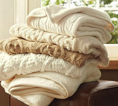
3. Cable Knit Throws - a little on the pricier side, but you gotta break out warm and cozy blankets for couch cuddling on those cool fall evenings!
Sale Price: $79

4. Hemstitch Table Linens - these table runners, place mats, and napkins will dress up your table setting for fall and thanksgiving dinners. They come in a variety of colors and can be monogrammed with your initial.
Price: $54 for a set of 6

5. Harvest Leaf Salad Plates and Dipping Bowls - serve your guests in fall fashion with this beautiful dinnerware.
Price: $24-$40 for set of 4


While I probably won't actually purchase many of these items, I can create the same look and feel with what I already have around the house. Plus, you never know what you can find that might be similar at places like Target, T.J. Maxx, or Marshalls. I hope to bust out my fall decor within the next week to give my abode this festive vibe!

So, now that you've seen a few of the items on my fall wish list, please share what you like to decorate your place with for a great fall feel! Pin It

September 20, 2010

The Ceiling: White vs. Color

There's a trend going around recently that says you should avoid assuming your ceilings should be painted white, and instead consider painting the ceiling a complimentary or even contrasting color to your walls. After all, the ceiling is the "5th wall" of the room so-to-speak. But how do you know if you should really follow this trend? Is it one that will become out-of-date eventually? Are there certain circumstances where you should definitely stick to a white ceiling?

These are all questions I'm pondering as I'm picking out paint colors for each of the rooms in the house. So far, I've stuck to white ceilings in the rooms we've painted, and I'm pretty satisfied with that as it keeps a bit more traditional look for our 82 year old house. But there are a couple rooms coming up, namely the dining room and bathroom(s), that I'm considering breaking the white-ceiling look for something a little more fun and well, trendy.

I figure if I paint only 1 or 2 ceilings in the house a different color then white, it won't be that much work to re-paint them down the road if I want to back to the all white look.

So, how do you decide which rooms are good choices for ceiling color? And which rooms aren't? Here are a few generally known rules to go by.

Generally, a white ceiling gives the feeling of height and space in a room. So, if you have a small room, it might be a good idea to keep the ceiling white. It gives the illusion of making the ceiling appear taller, and therefore of making the small space appear larger. This holds most true when you also keep the wall color light and bright.


But at the same time, having a darker color on a wall and white ceiling can actually make the space feel smaller. The idea follows a basic principle: a line between two colors draws attention to the end of the top of the wall, making the viewer more aware of the ceiling. This is what I'm most afraid of in the dining room as I'm planning to paint the walls a fairly dark color.


So, the idea of using one color for walls and ceiling is a way of disguising the ceiling so it blends in more, making the room appear more spacious.


But then, there's something fun about a ceiling painted either a different shade then the walls, or a completely different color then the walls. Take this picture for example...


Something else to consider is the use of crown molding in the space. Our dining room has beautiful plaster crown molding in it which does a great job of separating and defining the walls and ceiling - and I think that helps when you want different colors on the wall and ceiling. It's hard to pull that off without crown molding.

So, next comes the decision making. We're painting the walls first to see what that looks like with the current white ceiling. Then we'll consider painting the ceiling a color after that.

What do you think? Are you all for embracing the fun trendiness of a great color above your head? Or do you think color is meant for walls and ceilings should stick to the traditional, white look? Please share!

Pin It

September 16, 2010

Advice Needed: Project Reupholster

Have you ever reupholstered an armchair before (or any other piece of furniture for that matter)?

I haven't. But Joey and I are bound and determined to try! When we bought this house, the previous owners left a few pieces of furniture in it (at our request - they were going to take it to Goodwill). Two of things they left were cushioned arm chairs. You can actually see the chairs sitting on the right side of the living room in this picture (picture taken prior to purchase).

While slightly out-of-date, I knew these chairs had immediate potential. Bonus - they were extremely comfortable. And versatile. They could be used in the living room, dining room, porch - wherever extra seating was needed.

And believe it or not, these retro-style chairs are coming back into style again in a re-purposed sort of way. I've seen them used on HGTV-type shows multiple times.

Well, the other day, Joey decided it was time to give-it-a-go at changing up these bad boys. We knew we not only wanted to reupholster them, but we wanted to paint the wood white as well. To do both, the chair cushions - back and seat - had to be removed. Both chairs were brought into the basement for reconstructive surgery to begin.

Here are a few before shots...


Then the deconstructing began...

...and kept going until the cushioned back became a pile of rubble on the floor.

To which I asked - don't we need something to wrap the new fabric around?

At least the bottom cushion was still in tact (and had been re-framed at some point)...


Next, comes painting the frame. Then reupholstering the cushions. Then re-attaching the cushions to the chair.

The painting we can handle. I think I can even handle reupholstering and attaching the bottom seat cushion. But the back cushion (that is no more) I'm lost on. I'm assuming we can buy new cushion material somewhere and cut it to fit the wood back. But I'm slightly lost. Where should I buy the cushion? Plus the old cushion back had tufted buttons, which I'd like to re-add as well. How do I do that?

Does anyone have any experience in this or any practical advice to offer? It would be greatly appreciated! Pin It

September 13, 2010

Tip (Counter) Top Shape

In the last two posts, I shared with you the faucet and sink we are buying for our remodeled kitchen. Now I want to show you the third item we half-purchased this week (the other half will be paid upon installation). And that item would be our kitchen countertop.

As some of you know, we've been using a plywood-type temporary countertop over the past few months while we waited for the resources to become available for us to purchase the real counters we wanted for the kitchen.

And just like the sink and faucet, there were a ton of options to choose from when it came to purchasing countertops for the kitchen. Material and Color are probably the 2 things most people think about most when purchasing this item. Color is pretty easy as you can choose just about any color you want depending on your taste and decorating style. But which material to choose is a little trickier as form, function, and budget have to come into play. There are pros and cons to most options. So, you have to go with what works best for you and your budget.

Here are just a few of the common options available:

Laminate
Laminate is the most widely used countertop material in home improvement.

Pros: It is inexpensive and low-maintenance. It resists grease and stains, and it comes in a vast array of colors, and patterns. It also can come prefabricated with its own seamless backsplash.

Cons:
Laminate does have its drawbacks. Since it is, basically, made in layers (hence the name "laminate") the dark under layer (usually pressed wood) may be visible. The top is also susceptible to damage from sharp knives and hot pans, and once damaged, it cannot be easily repaired.

Cost: $15 to $60 per running foot.


Ceramic Tile
Beautiful and durable, ceramic tile is the experienced do-it-yourselfer's dream come true. This is where you can celebrate your creative side. You can make that counter anything you want. How about a mural? Or how about using your children’s drawings as patterns? Or simply go with your favorite colors broken up and mixed? It can be as simple or as complex as the artist in you desires.

Pros: Ceramic tile is heat, scratch, and stain resistant. Damaged tiles are easily replaced.

Cons: Grout can stain or collect food particles, therefore giving way to bacterial infestation. Tiles can chip or crack, and if used for cutting it can dull your knives. Scrubbing with abrasives can ruin a high-gloss finish.

Cost: $4 to $8 per tile.


Solid Surface

A solid surface countertop is a step up from plastic laminate. It comes in a larger variety of colors and patterns which are uniform throughout the piece. It can resemble glass, granite, and any other stone.

Pros: Since the color goes through the entire counter, scratches and blemishes can easily be buffed out. It is strong and self-supporting, so it needs no underlayment. It is non-porous. It resists both mildew and stains. It can be ordered custom-formed to hide seams, and it can be designed to suit your taste.

Cons: It can be cut easily by sharp knives. Hot pans will leave a permanent discoloration.

Cost: It's expensive at about $125 to $200 per running foot, professionally installed.


Stone

Nothing beats stone for sheer beauty and durability. This high-end choice is for the serious cook. Marble and granite are the most popular choices.

Pros: Granite is impervious (when properly sealed) to cuts, scrapes, burns and stains. Marble must be frequently sealed with mineral oil (which is not particularly food friendly, since it is made from petroleum). Its beauty is undeniable, and both surfaces are perfect for the serious gourmet cook. Pie crusts, pastries, and homemade chocolate love these surfaces.

Cons: Both stones are expensive, heavy, and often difficult to cut. They are brittle, so they must come in thick slabs. Marble requires frequent resealing. Both are expensive to repair. Both require regular waxing and polishing to maintain sheen.

Costs: Expect to pay up to $200 a running foot, installed.


Butcher Block

True butcher block uses end-grain hard-wood for counters; however many counters come in a lesser grade.

Pros: The warm natural appearance of hardwood is an attractive choice for the homeowner. It is ideal for cutting and chopping. It's relatively simple to install, and it is easy to repair. Surface scratches are easily sanded out.

Cons: It must be sealed or frequently treated with mineral oil. It must be cleaned immediately after food preparation and moisture exposure. Protective surface sealers are not always food safe. It is humidity sensitive, so it is not recommended for high humidity areas. It scorches and dents easily. If it becomes contaminated with meat juices or dirty vegetables, it must be disinfected, then resealed.

Cost: About $50 a running foot.


So, what did we pick? We went with a Quartz countertop in the color "Grey Expo".

What is quartz exactly?
Quartz is an engineered (man-made) stone countertop made from mostly quartz -- 93 percent quartz to be exact - combined with coloring pigment and a binding agent. Quartz makes an ideal countertop in many ways. It is one of the most durable manufactured countertops on the market. It can have the look of granite or marble, but without the high maintenance. The cost can vary depending on what type of quartz (color) you want.

Silestone Quartz is the brand that we're purchasing (and it's commonly sold at Home Depot, Lowe's, and most countertop retailers). Quartz tops that have a "granite" look with a lot of color variation are most expensive. Thankfully, I wanted a very uniform-color look and the option that caught my eye was actually in the least expensive line offered.

The color "Grey Expo" looks like a gray stone (go figure). It has some tiny little specs of color in it, but for the most part is 1 color. The grey color coordinates with the silver metal finishes I'm using in the kitchen. Quartz is very practical, yet still looks and feels like high end stone. We feel it will add that "high end" look without breaking the bank (like marble would have - which was my dream choice). And we should see at least a 100% return on the investment when we go to sell the house someday. Next to the cabinets, this is the most expensive item in the kitchen.


Professionals will come to the house this week to measure the space and put in the exact order.
3-ish weeks from there, the contertop should arrive.

Can't wait to show you pictures once this is installed! Pin It

September 10, 2010

Including the Kitchen Sink

As promised, I'm back with more details about our recent kitchen purchases. This post will focus on the kitchen sink we're purchasing.

Buying a kitchen sink sounds pretty easy, right? Well, it may not as easy as you think. There are about a million options (not exaggerating) to choose from when shopping for a sink. You can find different styles and brands of sinks in different stores as well as additional sinks online. And some places have the same sink options but for different prices. Where to begin?!

First, let's break down a couple of the main options to consider when purchasing a sink.

MATERIAL: What's the sink made of???
1. Stainless Steel: Found to be among the most durable sink materials, stainless steel is ideal for heavily used kitchens. Rust and water stains are easier to remove and happen less frequently. Stainless steel sinks are one of the most common materials being installed in homes.

Colors: Typically found in various shades of steel from muted finish to high gloss and shine finish.

Maintenance: The only requirements to maintain a stainless steel sink is to keep the sink bowl relatively rinsed and dry (not allow standing water for an extended amount of time), and wipe weekly with a special stainless steel wipe.

2. Natural Stone: Natural stone sinks are usually made of granite, marble, travertine, onyx, and soapstone. All of these options are thought to be great for any high-end kitchen. The natural stone does take significant maintenance and comes with a pretty hefty price tag but is resistant to scratches, dents, and stains.

Colors: Being a natural stone, the colors available are endless. Natural stone sinks should ideally be chosen in person to ensure colors are consistent with the homeowners color choices.

Maintenance: Most sinks composed of natural stone will have to be sealed with a special sealant at least twice a year. This will keep the sink from cracking or being damaged by water. It is also recommended that the only cleaner used be a mild soap without abrasive chemicals.

3. Cast Iron: Also known as "porcelain" due to the porcelain finish over the cast iron.
Colors: Cast iron sinks are known for being among the best sink options for the kitchen when seeking a sink in certain colors other than typical; black, white, and ivory. The way the sink is made enables it to be manufactured in essentially any colors you choose.

Maintenance: An advantage to the cast iron sink is that most harsh chemical cleaners will not compromise the material. These sinks will stain easy and may need an abrasive cleaning once a week to preserve shine.

Durability: People look to cast iron sinks regularly based on their durability. Made of cast iron, the sinks are noted as lasting much longer than average.

4. Cast Acrylic: Has a similar look to Cast Iron but without the actual cast iron base under the surface. Quite a bit cheaper in price, but it does scratch pretty easily.

Colors: Cast acrylic can be manufactured in most colors including standard and most common; black, white, and ivory.

Maintenance: Easy to care for simply wash with soap and water. Control staining by never leaving dirty dishes or standing water for extended periods of time.

5. Copper: Copper is among the least common kitchen sinks but has great appeal for those willing to pay the price. The color and details can be remarkable, and the care is normally easy. The price is driven up by difficulty creating a sink form from the copper and tricky installation is almost always a factor when choosing copper.

Colors: Copper is typically offered in the color of copper however the finish can be shiny to dull.

Maintenance: Keeping the sink relatively dry when not in use and wiping it down with a mild soap often is about all it will need. Be prepared for some dulling and scratches as the sink ages.

Durability: Copper sinks are semi-durable but thought to be among the least durable for the money in today’s market.

STYLE: What's the look of the sink, and how is it installed in the countertop?
1. Under-mount
: Under-mount has gained popularity in homes over the last five years. The sink is mounted underneath the countertop to create a rimless look on the countertop. Usually can't be used with Laminate countertops... best with stone or solid surface counter materials.

2. Top-mount/Drop-in/Self-Rimming (3 names - same thing): A top-mount kitchen sink is installed with its outer rim sitting on top of the countertop. This option is very easy to install but does come with a few disadvantages. When wiping down the countertop, things can not be easily swept into the sink as with the under-mount. However, this style will help prevent water from being swooshed onto countertop surfaces with the lip providing as a shield. This is the most common style of sink being used in homes today.

3. Apron Front: Also referred to as a “farmhouse” sink, the apron front sink is the most detailed and designer look offered for the kitchen today. The name comes from the fact that the front of the sink is visible creating what looks like an apron on the front of the countertops. Most apron front sinks will require a custom sink cabinet to be installed.

4. Tile-In: Tile-In sinks are growing in reputation as more homeowners are turning to tile countertops. Granite is often too expensive, but granite tile will fit most average kitchen renovation budgets. The tile-in mounting will create a much better look with tile countertops. Simply install the sink then take advantage of the tile width rim which tiles can be installed on top of to create a flush look. This is today’s fastest growing style of all sink options for the kitchen.

5. Flush mount: This type of sink is formed by the fusion of sink and counter - such as with a solid surface material (like corian).

Whew! A lot of possibilities, right? And there's still color, shape, and size to consider in addition to the above.

Thankfully, with all these options being considered, I already had a pretty good idea of what kind of sink I wanted. So, I started by searching online for "the perfect sink". When I found what I wanted, I was then able to look it up through different websites to find the cheapest price (why pay more when you can pay less?).

Here were a few of the sink "musts" that I wanted...
Material: Cast Iron (Porcelain)
Color: White
Style: Undermount

With the above as my "search" criteria, I was able to pull up a plethora of sink options online and had several other options to consider: number of basins, shape, size, brand.

Ultimately, I decided on a sink with 2 basins. Although I considered just 1 large basin, I thought 2 was more practical - you get 2 separate spaces for doing dishes, prepping food, rinsing etc. Plus 2 separate drains. Bonus feature on my sink: The divider between the 2 basins is a low profile divider, meaning it doesn't come up as high as the sides of the sink. This allows for large items to be washed easily as if it were 1 basin.

Shape was not super important to me. Round vs. Square vs. Oval vs. something else.... The sink I happened to really like had a square basin. It gives it a little more modern look.

For Size, each basin is 9 inches deep - about as deep as you can get without being custom.

The brand is Kohler, which is well known for quality and got great reviews and sold in several stores.

The price? Here's where shopping around is handy. If we purchased the sink directly from Kohler, it would cost about $715. Too much. But Home Depot and Lowe's both sell this sink for less. Home Depot was actually the cheapest at $490. Lowe's was slightly higher at $537. However, it just happens to be Lowe's policy that they will match their competitors prices PLUS take off 10%. So, with that, we were able to get the sink for $441 at Lowe's.

And here it is (you had to read a lot to get here)...


What do you think? Would this be the sink of your choice? What would you choose differently and why? Do tell! Pin It

September 9, 2010

Kitchen Countertops? Sink? Faucet?

Check! Check! And check!

As in, they're all ordered. Finally. Now it's just wait time for everything to arrive and be installed. And I can't wait!!! Hopefully, in 4 weeks, I will have a more permanent and functional kitchen. We shall see...

And what exactly did we order, you ask? Well, let me start to share the goods with you!

For this first post, I'll give you a small nugget of detail by revealing the faucet. All the metal finishes in the kitchen are going to be polished nickle/chrome. Hence, I wanted the faucet to match this as well. We wanted something simple and practical with a combination of traditional and modern elements (high expectations for a faucet, I know). We did a lot of searching (went to Menard's, Lowe's, and Home Depot all in one night). But ultimately, we found the best faucet for the cheapest price online. And it got great reviews by consumers which was something we were looking for as well.

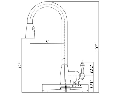
The website we found was for a company called Mr.Direct - a small manufacturer in Ohio. Ever heard of it? Didn't think so. The faucet we found here meets a long list of our demands, which I've explained below...

(Sorry these pictures aren't that great. I had the worst time finding pics online.)

Note: We did not order the faucet plate (base-type-thing) shown below as the faucet will sit directly on our countertop.


Here is everything we (I) liked about it:
1. Finish is Chrome - it matches all our other metal finishes in the kitchen.
2. Gooseneck shape - practical for fitting large pots and pans under it. Plus it's a fairly traditional design.
3. Pull-down sprayer - while I was against this initially, Joey talked me into it. It is more functional to have the sprayer attached to the faucet because the sprayer can reach the whole sink area more easily. Bonus - it keeps us from cutting an extra hole in our countertop for a separate sprayer. It also gives the traditional faucet a slightly modern touch.
4. 1-handle lever - this was an absolute must for me. I didn't even look at faucets with 2 handles. For a kitchen, when my hands are covered in food and dirt and icky-ness, I want to be able to flip the lever down and around with 1 hand. Practical is my middle name. I like that the handle has some curve to it (instead of stick straight like many we saw). Again, a little more traditional.

This all-in-one faucet will allow us to just cut 1 hole in our countertop for the faucet base to sit on and leave the rest of the area around it nice and clean. Love it.

Total Cost: $112 + shipping

So, what do you think? Good choice?

Stay tuned for pics of the sink and counters! Pin It

September 7, 2010

Color Personality Quiz

I love taking quizzes! Especially personality-type quizzes. Anyone else with me on that? Maybe not... But I came across a website that offers not one, but two quizzes! 2-for-1 is always a bonus in my book!

And what are these quizzes all about, you ask? Well, the first quiz is a color personality quiz (I love color, of course). The quiz focuses on the interior of the home and explains what color combination's are best suited for your needs and personality.

The second quiz is an exterior personality quiz. It explains what exterior style of house best matches your likes and personality.

So, let's take a look together to see how accurately this website defines style-personality (for me).

Quiz #1: Color Personality
I found this quiz especially difficult because the questions they asked had multiple answers to them, yet I could only pick 1 answer. So, my guess is that I could potentially get a lot of different results by tweaking my answers slightly.

For example, here is question #3:


How am I supposed to answer THAT? I want my home to feel Happy. And Welcoming. And Tranquil. And.... These were the types of questions I hated on Tests in school - multiple correct answers but you have to pick the one that's MOST correct (ugh!). I never got those right. So, I went with my gut on this one and picked "welcoming" as the mood I MOST wanted. Several of the other questions were similar to this.

Only the first 2 questions asked about your actual color preferences...


...and honestly, I think the end results were based solely on these 2 questions and had nothing to do with any of the other answers.

So, after answering all the questions, the quiz concluded that my interior color personality is....

RAFFIA! (who comes up with these names?)

Raffia is a collection of neutrals and interesting greens that signify a timeless appreciation of diversity. A person drawn to this palette appreciates texture and the importance of tactility in all surfaces. They wish for a sophisticated environment that is also casual. They seek a balance with nature and time.

I guess "raffia" is supposed to look something like this...


Is that really me??? I do like neutral and green colors. But I'm not sure the picture really demonstrates my overall color style. So, I'll give this quiz like a 3.5 out of 10 for accuracy. Not so good.

Quiz #2: Exterior Personality
I enjoyed this quiz much more than the first quiz. I thought the questions were easier to answer and it did a better job pin-pointing my true design style.

An example of one of the questions is...
2. Pick the neighborhood that best describes where you live:

  • A suburban community where the homes in each development are similar in style, with a limited array of colors. Most colors are in keeping with the classic look, and the neighborhood has a cohesive appearance.
  • A community of homes that are somewhat unique in their color schemes. Often there is a variety of styles and they provide an opportunity to create your own palette. While there are no restrictions on colors, homeowners tend to reflect the influence of their neighbors and environment.
  • A neighborhood where homes tend to be on large parcels of land. Homes are designed and built to the homeowner's taste. Colors and styles are varied and limitless.
  • A neighborhood where homes are a mix of styles, sizes and ages. Neighbors are well acquainted and there is a strong sense of community. Colors are chosen that reflect the friendliness of long-time neighbors.
I picked the last option, which fit the description of my neighbor hood very well.

In the end, the quiz determined that my exterior design style is....

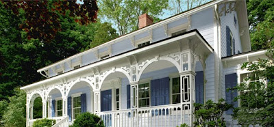
COTTAGE! (a normal name)

Cottage is a welcoming palette that truly makes a house a home (that seems to fit one of the answers I put in the first quiz!). These colors bring out the charm of your neighborhood gem. A casual architectural style is best suited for this palette. Bright trim and accent colors bring out the interesting features such as shutters, porch railings and window boxes. Coordinating the colors with the flowers and shrubs increases your home's curb appeal.


I thought this conclusion fit me (and my house) much better than the first quiz. I'd give it a 7 out of 10.

So, what do you think? Did either quiz define your color or exterior personality accurately? Or was it waaaay off? Please share! Pin It

September 1, 2010

DIY: Spend Little, Gain Much!

I found this article online that shares some great ways to add value to your home and set it apart from other homes in your area without killing the bank account. This is especially helpful if you're trying to sell your home and want some easy upgrades to make it more appealing to buyers.

And even though we're not looking to sell our house right now (obviously), I still found the article interesting because we are working to update our home to fit our lifestyle and we want to get the biggest bang for our buck when it comes to these updates! Plus, we want to be prepared for the future when/if we have to sell, and so appealing to the most people is the way to go.

Luckily, we've already started doing some of things mentioned in the article, and other items are on the "to do" list for the future.

The first few of the upgrades that the article mentioned are the ones that I liked best! Each costs less than $500 and should require less than a day’s work.

1. Replace Sinks & Faucets
Estimated Price: Sink $100-500 & Faucet $150
The kitchen is always the place to start when it comes to upgrades to the home. Even if you can't afford the big expenses like new cabinets or new countertops, upgrading the sink and faucet gives a fresh, new feeling on a low budget. Getting energy efficient faucet is especially appealing as it can reduce water usage by 30%.

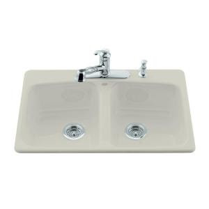
Here's a nice white cast iron sink from Home Depot for $199...


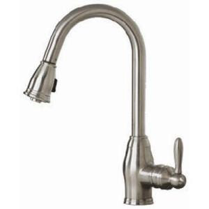
And a brushed nickle pull-down faucet to go with it for $150...


2. Backsplashes
Estimated Price: $5-$14 per 1 square foot of space
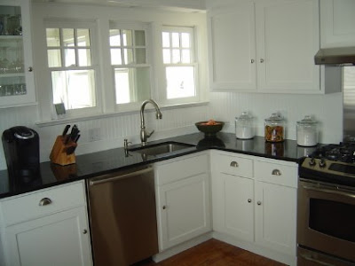
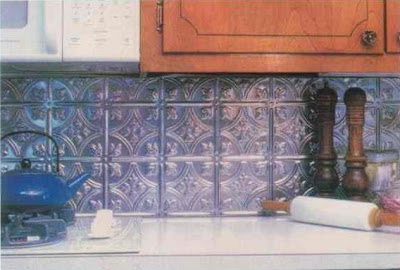
Again, the kitchen is the place to invest, and one of the easiest way to make your kitchen "pop" and set it apart from other kitchens is with a new backsplash. Your kitchen can go from outdated to modern in a day, and there's a variety of options to choose from including...

Tile


Beadboard


Tin

There are even peel-and-stick options available for a super cheap and easy way to go.

3. Vanity Cabinets/Toilets
Estimated Price: Vanity/Sink $200-$400 and Toilet $250
Bathroom is the next best place to invest cash in the home. Even relatively minor updates to your bathroom can produce a return on investment of over 150%. Because toilets fit neatly over existing plumbing, they’re surprisingly easy to install. And just like kitchen faucets, look for modern water-saving toilets that will both save on your water bills and appeal to energy-conscious buyers when it’s time to sell.

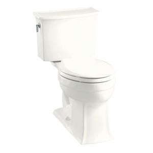
Who wants an old green toilet, when they can have a sleek white one?


If you’re feeling creative, save hundreds of dollars on a new vanity by using an old dresser as the foundation. Simply cut out room on the top to hold a basin sink and to connect pipes.


Or you can go nice a simple with a new pedestal sink.


4. Paint
Estimated Price: $30 per paint can
You know this is one of our favorites. It’s amazing what a fresh coat of paint will do to immediately transform any room in your house. Keep in mind that lighter shades generally make a room feel larger and neutral shades will appeal most to potential buyers. You’ll earn a 250% return on your investment in freshly painted interior walls. And don't forget about painting cabinets or trim or anything else that's outdated!

Go from this...


....to this for just a few dollars and some sweat equity.


5. Crown Molding
Estimated Price: $5 per linear foot
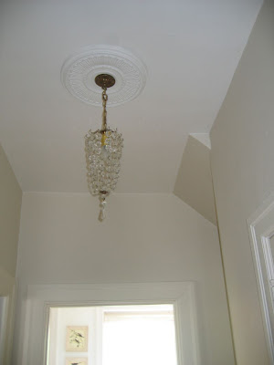
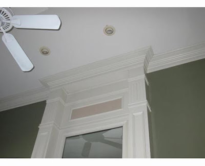
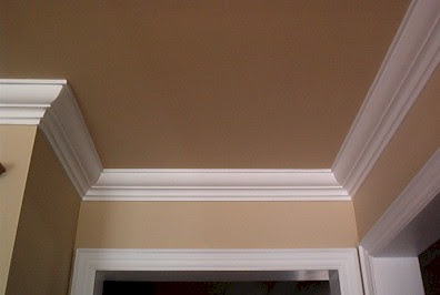
Crown molding in your home compared with none in a similar home in your neighborhood could make a difference when it’s time to sell. You may not get the money back, but it’s a feature that most buyers appreciate when looking for a home. It was one of the first things that grabbed our attention in the home we bought and we get comments on it all the time from people...


So, what do you think? Do you agree with the article? Are these upgrades worth the small-ish investment? Or are you better off without?

Pin It
Visit InfoServe for Blogger backgrounds.